极简主义的Logo将为品牌带来哪些益处?

一个公司的Logo对于公司发展至关重要,因为它代表着用户对品牌的认可和信赖。
近日,很多大牌都在大幅修改他们的商标。专家认为,一个极简的Logo将更适合新媒体平台传播,并且更容易吸引用户的眼球。
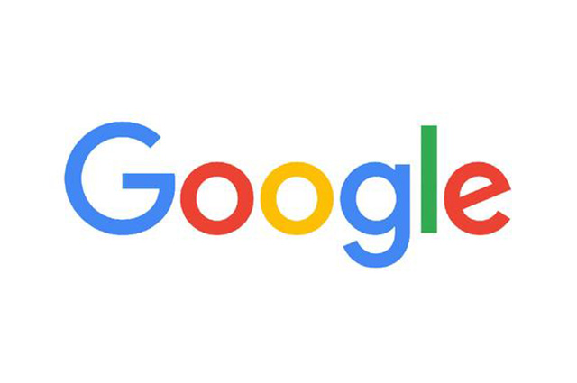
谷歌更新了旗下所有Logo,为邮件、日历和搜索引擎提供了更简单、丰富多彩的图标。
今年早些时候,支付宝推出了一款新设计,其色彩饱和度更高。汽车制造商起亚(KIA)也宣布明年将推出一款新车型,其Logo的色彩对比更清晰,设计更简单,摒弃此前令人困惑的圆圈标志。
A company's logo can be crucial to its development, as a key to instant customer recognition and brand loyalty among users.
But recently a lot of big brands have been overhauling their logos. Experts believe that a brighter and simpler logo will be fit for emerging media platforms and impress more customers online.
Google recently updated all its logos and icons, coming out with simpler, more colorful icons for mail, calendar, and Google Drive. China's Alipay came up with a new design earlier this year, with darker and higher contrast. And automaker KIA has announced a new one for next year - simpler, higher contrast, and they've gotten rid of that confusing circle around the company name.

上海交通大学设计学院萧冰教授在接受CGTN采访时表示,“这一变化背后的一个关键原因是:这些图标需要与日新月异的社交媒体不断同步发展。”
“彩色Logo现在很常见,随着科技的发展,Logo需要在碎片化多屏时代吸引人们的注意力。专为平面媒体设计的旧版本已经不再需要,所以公司也需要与时俱进。”他补充说,“随着人工智能、大数据和3D全息技术的进一步应用,Logo肯定会有更多的变化。”
Prof. Xiao Bing from Shanghai Jiaotong University's design school told CGTN one of the crucial reasons behind the change is the changing media on which the logos appear.
"Colorful logos are quite common now because the development of technology means they now need to look good on screens. Older ones designed for print media are no longer needed, so companies are making revisions," Xiao said, adding that "with the further application of artificial intelligence, big data, and 3D holography, there will definitely be more changes."
Yess Creative & Design的合伙人认为,极简主义,色彩明亮是新Logo的未来趋势。
“公司都在努力发展电商平台,在过去,Logo可以手工设计,制作流程非常复杂。现在,Logo必须在碎片化多屏时代,给消费者留下深刻的印象。”
“可口可乐,支付宝和星巴克都在把他们的Logo做得更简单。”
Yan Junchang, the partner of Yess Creative & Design, considers simpler and brighter as the obvious trends for those new logos.
"Companies are all putting their efforts into e-commerce, so while in the past, logos could be designed by hand and be quite complicated, now you have to impress consumers online. Coca-Cola, Alipay, and Starbucks are all making their logos simpler," Yan commented.

做一个适合新的传播渠道的Logo是公司变革的一种方法,但新设计成功与否在于消费者对它的接受程度。
谷歌、Instagram和星巴克都在关注消费者对其Logo变化的看法,新Logo对公司未来的发展至关重要。
“Logo的变化会给消费者带来全新的形象,但如果设计得不够好,这些变化就会带来负面影响。这取决于新商标是否符合消费者未来的预期。”萧教授总结说。

Making a logo suitable for new communication channels is one thing, but it turns out another factor with new designs is what consumers think of it.
Google, Instagram, and Starbucks have all been monitoring what consumers think of their changes. The new logos can be just as crucial to a company's future as the old ones were.
"Changes in logos will present a fresh image to consumers, but if they are not good enough, the changes will have negative impacts. It depends on whether the new logos meet consumers' expectations," Xiao noted.
来源:CGTN
 731
731 10.0万
10.0万


